That gap — between text that gets skimmed and video that converts — is why product explainer videos have become a core part of buyer education. According to Wyzowl's 2026 report, 96% of people have watched an explainer video to learn about a product or service, and 85% say a brand video convinced them to make a purchase.
This guide covers everything you need: a clear definition, the six main video formats, 13 real-world examples broken down by style, what separates effective videos from forgettable ones, and a step-by-step production process.
Key Takeaways
- 96% of consumers watch explainer videos to learn about products — this format is buyer education, not a creative bonus
- Six core formats: animated, live-action, whiteboard, screencast, motion graphics, and hybrid
- The strongest explainer videos lead with the customer's problem, not the product's features
- Aim for 60–90 seconds for inbound content; cut to 30–45 seconds for paid social ads
- Captions aren't optional — Meta's own data shows captioned video ads increase view time by 12%
What Is a Product Explainer Video (and Why Does It Matter)?
A product explainer video is a short, focused video — typically 60–120 seconds — that communicates what a product does, why it matters, and what the viewer should do next. Think of it as a video-form elevator pitch: it captures your brand promise and answers "why should I care?" without turning into a tutorial or a full product demo.
That distinction matters more than most marketers realize. A tutorial or full demo assumes the viewer is already sold — an explainer video is for everyone else. Its one job: convince someone who's never heard of you that your product solves their problem.
Why Video Outperforms Text Here
When a concept is abstract or complex, text forces the reader to visualize it themselves. Video removes that friction — which is why comprehension and retention both go up.
That cognitive advantage translates directly to revenue. Wyzowl 2026 reports:
- 83% of video marketers say video directly increased sales
- 82% say video gives them good ROI
- 57% say it reduced their support ticket volume
One caution worth noting: the often-repeated claim that video automatically boosts landing page conversions by 80% doesn't hold up to scrutiny. Unbounce's analysis of roughly 35,000 landing pages found that embedded video did not reliably improve form-fill rates and sometimes hurt click-through performance. The takeaway? Video is powerful, but placement and context still matter. Test before you assume.
Types of Product Explainer Videos
Format choice comes down to three things: your product's complexity, your brand personality, and your budget. Each format has a job it does well — and a context where it falls flat.
| Format | What It Does Best | Ideal For |
|---|---|---|
| Animated (2D/3D) | Visualizes abstract concepts through characters, scenes, and motion | SaaS, fintech, abstract digital products |
| Live-action | Builds authenticity with real people and real environments | Physical products, B2C brands, human-centered services |
| Whiteboard | Simplifies step-by-step reasoning through drawn illustrations | Education, consulting, process explanation |
| Screencast/walkthrough | Shows the actual product UI in real time | SaaS onboarding, software demos, feature education |
| Motion graphics | Combines moving text, icons, and shapes to tell data-driven stories | B2B, finance, stats-heavy value propositions |
| Hybrid | Blends live footage, animation, and UI capture | Complex products that need both human trust and visual clarity |
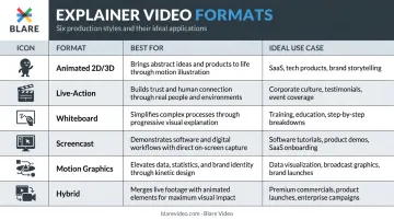
A SaaS platform with abstract features typically suits animation: you can visualize workflows that simply can't be filmed. A physical product or people-forward brand tends to benefit more from live-action, where real faces and real environments build credibility.
Production requirements differ substantially between the two. Live-action involves camera equipment, lighting, location logistics, and on-screen talent. Animation requires illustration time and motion design work. Either path carries real cost implications worth understanding before you commit to a format.
Those cost differences can be wide. Wyzowl's 2024 pricing study found quotes for a 60-second animated explainer ranged from $600 to $250,000, with a median of $5,400 and a trimmed average of $8,457 — driven by team seniority, custom music, and turnaround speed.
13 Product Explainer Video Examples Worth Studying
Animated Explainer Videos: Simplifying the Abstract
Dropbox used animation to solve a validation problem before the product even existed. Drew Houston posted a demo video showing how Dropbox would work, and the beta waitlist jumped from 5,000 to 75,000 overnight, fueled by over 10,000 Diggs in 24 hours (per TechCrunch's 2011 report).
The video worked because it framed a universal frustration — losing files across devices — before showing the fix. Nobody had to imagine the problem.
ClickUp takes a different angle: competitive differentiation. Their animated content consistently positions ClickUp as the one tool that replaces multiple apps, speaking directly to the pain of app overload. The animation lets them visualize a chaotic multi-tool workflow collapsing into a single dashboard, something live-action can't replicate as cleanly.
HubSpot's Breeze AI explainer uses animation to make artificial intelligence feel approachable rather than intimidating. Abstract concepts like AI-powered workflows become concrete through character-driven scenes and motion graphics that walk through real use cases.
What this approach does well: animation removes cognitive load. When viewers don't have to visualize a concept themselves, they comprehend faster and retain more. The two techniques that appear in every strong animated explainer: character-driven scenarios and motion graphics for data.
Live-Action Explainer Videos: The Human Connection
Asana keeps its live-action videos focused on outcomes, not features. Real people appear in recognizable work scenarios: project chaos, missed deadlines, team misalignment. The product appears as the resolution. Human faces signal: this was built for someone like you.
Airbnb leads with emotional storytelling over product functionality. Their "Strangers aren't strange" campaign builds around the brand mission of belonging, letting the emotional resonance do the persuasion work. The product almost becomes secondary to the feeling.
Gong pairs voiceover with interface visuals and social proof. Their product overview opens with "Want to close more deals?" — a direct hook into buyer intent — before walking through what the platform actually reveals about sales behavior.
The pattern here: live-action builds trust through authenticity. Human faces, real environments, and customer-recognizable language make viewers feel the product was made for someone in their situation. That feeling consistently outperforms a feature list.
Screencast and Product Walkthrough Videos: Show, Don't Tell
Monday.com walks through actual dashboard setup while narrating use cases for different team types: marketing, operations, product. Watching a real setup removes the "but will this work for my team?" objection before it forms.
Notion's AI video presents a concise product explanation of how Notion AI works across Notion, Slack, and Google Drive. A warm, calm voiceover makes the feature feel approachable rather than technical, an important distinction when the audience includes non-technical buyers.
Calendly opens with the pain point: scheduling is frustratingly chaotic. Then it shows the solution in action. The real interface appears quickly, and value is demonstrated rather than described.
Why it works: showing the real interface eliminates buyer hesitation. When prospects see exactly how a product works, usability objections dissolve before the sales conversation begins. No amount of testimonials fully replicates that.
Whiteboard and Motion Graphics Videos: Clarity Over Polish
Slack's "So Yeah, We Tried Slack" video is a masterclass in before/after framing. The narrative starts with skeptics, people who thought Slack wouldn't make a difference, and tracks their conversion. The structure is simple: chaotic workplace → Slack → order restored. No elaborate visual effects needed.
Headspace uses character-driven animation and a direct CTA to drive sign-ups. The charm of the characters does emotional work that a talking head couldn't. Even a meditation app becomes memorable through consistent character design and a lighthearted tone.
Mailchimp has produced motion graphics content where visuals and text carry the message without narration. Icons, shapes, and moving text tell the story silently, useful for social feeds where audio is often off.
The takeaway: simpler visuals sharpen focus on the message. When you strip away cinematic production, the narrative carries more weight, and that constraint produces cleaner, more memorable storytelling. Humor and character design can make even routine products stand out.
What Makes a Product Explainer Video Effective?
Lead with the Problem, Not the Product
The strongest explainer videos don't open with a logo or a product name. They open with a scenario the viewer recognizes as their own problem. Calendly starts with scheduling chaos. Slack starts with email overload. The viewer's internal response is "yes, that's me" — which means they're already invested before the product appears.
Follow a Four-Part Narrative Arc
High-performing explainers share the same structure:
- Problem — Establish the pain point clearly and quickly
- Solution — Introduce the product as the answer
- How It Works — Show the mechanism in plain, visual terms
- Call to Action — Tell the viewer exactly what to do next
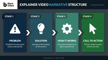
Skipping or rushing any stage weakens the arc. A video that jumps straight to "here's how it works" loses the viewer who hasn't yet agreed they have the problem.
Get the Length and Pacing Right
- Inbound content (homepage, product pages, YouTube): 60–90 seconds
- Paid social ads: 30–45 seconds
- Product demos (separate from explainers): 2–5 minutes
Vidyard recommends 60–90 seconds for explainer videos, and Wyzowl's 2026 data shows 71% of viewers believe 30 seconds to 2 minutes is the most effective length overall. Pacing matters as much as length — natural pauses, synced voiceover, and well-timed transitions keep retention high. Vidyard reports 65% of viewers complete videos under 1 minute.
Design for Silent Viewing
The old "85% of Facebook videos are watched without sound" claim is poorly sourced and should be retired. What Meta's own data does confirm: captioned video ads increase view time by 12% on average, and 80% of mobile users react negatively when video ads play loudly without warning.
Captions and on-screen text aren't optional extras. They're how a meaningful portion of your audience experiences your video — build for silent comprehension from the start.
Treat Production Quality as a Trust Signal
Wyzowl 2026 reports 89% of consumers say video quality affects their trust in a brand. A shaky, poorly lit video signals the product behind it is just as unpolished. Voiceover tone and background music also matter — music sets the emotional context; the voice creates credibility.
How to Create a Product Explainer Video: Step-by-Step
Step 1: Define the Goal and Audience
Before a single frame is shot or animated, answer these questions:
- What should the viewer do after watching? (Sign up, book a demo, buy now)
- Who is this video for — their role, their pain points, their level of product familiarity?
- Where will this video live — homepage, email, paid ad, trade show?
Every production decision — format, length, tone, CTA — flows from this clarity. A video designed for a cold LinkedIn audience needs a different hook than one embedded on a product page where visitors already know your category.
Step 2: Write a Script Built Around Benefits
Start with the viewer's pain point. Introduce the product as the relief. Explain how it works in plain language. End with a specific CTA.
A practical benchmark: 150–200 words for a 60-second video. That pace leaves room for natural delivery without rushing. Write for the ear, not the eye — short sentences, no jargon, clear transitions.
Step 3: Create a Storyboard
A storyboard maps the visual flow scene by scene before production begins. It prevents misalignment between audio and visuals, eliminates costly reshoots, and ensures the director, editor, and client are all working from the same vision.
Even a rough hand-drawn storyboard improves the final output. Blare Video builds storyboarding into every pre-production workflow for exactly this reason — once cameras roll, surprises get expensive.
Step 4: Produce with Quality in Mind
Viewers make unconscious quality judgments about your product based on how your video looks and sounds. For live-action shoots, these elements are non-negotiable:
- Lighting — flat or uncontrolled light makes even premium products look cheap
- Camera equipment — resolution and stability affect perceived credibility
- Audio capture — clean sound is more critical than perfect image
- On-screen talent — confident delivery keeps viewers watching
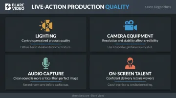
Viewers will tolerate a slightly imperfect image far longer than muffled or distorted audio. Sound is the first thing that loses an audience.
For broadcast-level results, Blare Video manages the full technical pipeline — from scripting and talent casting through filming on cameras like the 8K Red Raptor, into post-production covering color correction, motion graphics, and music licensing. Client review runs through a collaborative online platform where feedback gets incorporated without email chains slowing the process.
Step 5: Edit for Retention and Distribute Strategically
Good editing is measured by what viewers don't notice — cuts that feel earned, pacing that never drags, and anything that doesn't move the story forward already gone.
For distribution, plan multiple versions from the start:
- 16:9 horizontal — YouTube, website embeds
- 9:16 vertical — TikTok, Instagram Reels
- 1:1 square — LinkedIn, Facebook feed
Blare Video's standard workflow delivers all three aspect ratios, shooting at 4K or higher with centered framing so vertical and square crops maintain quality. Add captions to every version — not as an afterthought, but as a designed element.
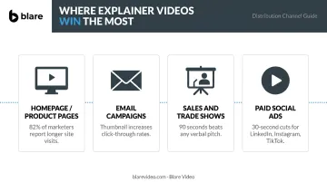
Where to Use Your Product Explainer Video
Highest-Impact Placements
Homepage and product/feature pages deliver the most value per view. A visitor who watches your explainer above the fold understands your product before reading a single line of text. Wyzowl 2026 reports 82% of marketers say video helps keep visitors on their website longer.
Note: embed placement still requires testing. Homepage videos tend to perform well for time-on-page; landing page impact varies by page type and offer. A/B test before drawing conclusions.
Secondary Distribution Channels
Your homepage video shouldn't sit idle — repurpose it across every channel your buyers already visit:
- Email campaigns — A video thumbnail in an email significantly improves click-through rates. Even a static image with a play button increases open-to-click engagement
- Sales presentations and trade shows — A polished explainer communicates more in 90 seconds than any verbal pitch
- Paid social ads — Shorter, punchy edits (30 seconds) of the main explainer perform well on LinkedIn, Instagram, and TikTok
Match Format to Platform
The same master explainer needs to be edited differently for each channel. A 90-second horizontal cut for YouTube requires different pacing than a 30-second vertical cut for Instagram Reels. TikTok's official guidance calls for vertical, full-screen content created for sound-on. LinkedIn supports landscape, square, and vertical formats — each with different audience behavior.
A single production budget can cover all of these placements — as long as you plan platform-specific cuts before editing begins, not after.
Frequently Asked Questions
What is an explainer video?
An explainer video is a short video — typically 60–120 seconds — designed to communicate a product or service's core value clearly and quickly. It differs from tutorials (which teach how to use something) and full demos (which show every feature) by focusing purely on why the product matters.
What are the different types of explainer videos?
The six main formats are animated (2D/3D), live-action, whiteboard, screencast/product walkthrough, motion graphics, and hybrid. Each suits different products, budgets, and brand personalities. The right choice depends on what you're selling and how your audience prefers to engage.
Do explainer videos have to be animated?
No. Animation is popular because it handles abstract concepts well, but live-action, screencast, and hybrid formats are equally effective for many products. The best format depends on what you're selling and who you're selling to.
What is an animated explainer video?
An animated explainer uses motion graphics, 2D or 3D characters, or illustrated scenes to communicate a product's value. It's especially useful for digital, abstract, or complex products where the concept can't be filmed directly.
What is a corporate explainer video?
Corporate explainer videos are produced for B2B or internal audiences, covering company offerings, services, or processes. They prioritize clarity and professionalism — but the strongest examples don't sacrifice engagement to get there.
What are the four elements of a good explainer video?
A clear script, engaging visuals, quality audio (voiceover and music), and a strong call to action. All four must work together. Weak audio undermines a well-written script, and strong visuals without a clear CTA won't convert viewers into customers.